
OK, so it's come to this. There are people who doubt it is even warming at all, even on a thirty year time scale. Presumably all the migrating species zones and retreating glaciers and shortened snow cover seasons don't count for anything.
Dick Cheney doesn't doubt it is warming. Sarah Palin doesn't doubt it is warming. Lake Mendota, for its part, is clear about what's happening in Wisconsin. But Joe d'Aleo of icecap thinks otherwise, and in certain circles he is taken at face value on such things.
As we saw a few days ago he is attributing the following:

to Klotzbach et al. 1999.
Per my suggestion this has been very slightly amended as follows:
When you do a difference in the satellite trends of both UAH and RSS with NOAA NCDC land stations, you see an increasing warm bias in the NOAA data which explains why months with major cold in the news get ranked so high by NOAA and not by the satellite sources.Emphasis added; d'Aleo has not acknowledged my advice or the importance of the change that I noticed.
Now this is a very consequential difference indeed, though the difference is hardly stressed in the narrative. Land data covers perhaps 25% of the earth. The difference of about 0.44 C (whatever it signifies) must be divided by 4, leaving an uncertainty in the trend of 0.11 C per 30 years, or about 0.04 C per decade. This is large enough to be a matter of some concern, but by no means large enough to change the big picture of global warming which are substantially higher. So I'm willing to write the whole thing off.
But considering the dramatis personae on this paper, one wonders exactly what is going on. Is d'Aleo's effort the leading edge of a push to make this a major talking point among certain disgruntled groups at the fringes of climate science? How does this outlier of a paper align with the CCSP report on lower atmosphere temeprature trends which clearly bent over backwards to give the Huntsville folk the benefit of the doubt?
I think that before taking up the Klotzbach paper, it's clear that we should be reading between the lines of the CCSP report.
One thing that report proves, anyway, is that dissenting opinions are hardly ignored in American science. Indeed, they get 130 page glossy reports trying to respond. Note that Christy is a coauthor of the executive summary, which states right off the bat that
Previously reported discrepancies between the amount of warming near the surface and higher in the atmosphere have been used to challenge the reliability of climate models and the reality of human induced global warming. ... This significant discrepancy no longer exists because errors in the satellite and radiosonde data have been identified and corrected. New data sets have also been developed that do not show such discrepancies.In short, the problems we are currently experiencing reconsiling model to data are much smaller than those in the past. This is a success in collaboration between observational and modeling communities first of all, and a demonstration of the power of models in the advancement of science.
...
For recent decades, all current atmospheric data sets now shouw global-average warming that is similar to the surface warming. While these data are consistent with the results form climate models at the global scale, discrepancies in the tropics remain to be resolved.
Neither models nor observations are very clear about whether the surface is warming faster or slower than the troposphere. This is all about vertical amplification in the tropical troposphere.
The report acknowledges that the tropical middle-troposphere amplifies short time scales:
For month to month and year to year variations, models and observations both show amplification (the ... variations are larger aloft than at the surface.) This is a consequence of relatively simple physics, the effects of the release of latent heat as iar rises and condenses in clouds. The magnitude of this amplification is very similar in model and observations.However, disagreement is found at longer time scales, where observations show greater warming at the surface while models retain greater warming aloft.
There is no obvious reason to prefer model prediction over observation data or the reverse. The data could be wrong or the model could be wrong. The CCSP report gears up to argue that it is the satellite data that is wrong.
Section 2 discusses the limitations of the observational data frankly. However, they note that discrepancies between satellite trends are much larger than discrepancies between surface trends.
All in all it's pretty much inside baseball. Everyone agrees we need the satellites to stay functioning. Got that, delayers? Nobody wins if we have no data, OK?
So all in all, I don't see where all the sound and fury is supposed to be leading. Despite huge progress, we still have an outstanding problem in contemporary atmospheric trends. OK. And?
Update: This show is in reruns. See the following articles on Realclimate:
- Tropical tropospheric trends
- Tropical tropospheric trends again
- Tropical tropospheric trends again (again)
So Klotzbach is a variation on a previous molehill.
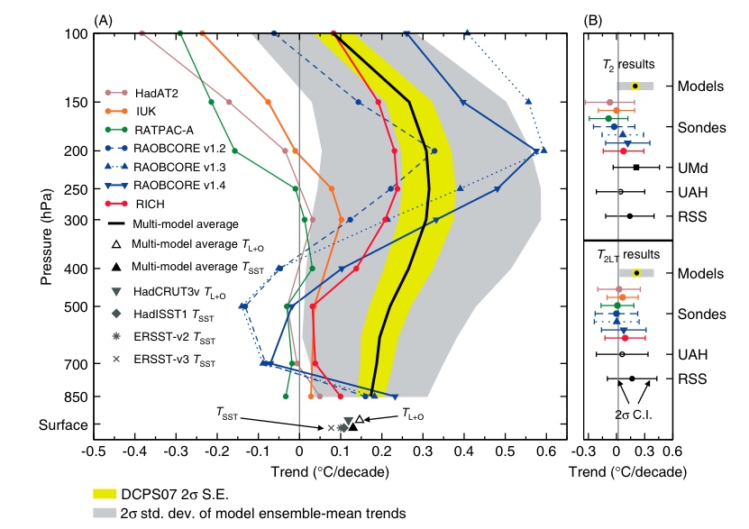
compares models and the datasets. Shaded is the range of model estimates of tropospheric temperature trend profile, while the lines represent various inversions of satellite data. The satellite inversion problem is not trivial. Extracting trends is more difficult yet, as some of the heuristics of the inversion may drift under climate change as well as under instrumental aging. The spread here makes clear that the method of doing so is not established. So when we look through Klotzbach, let's keep in mind that the spread in the estimates of the quantity of interest is huge.
And then there is this deep analysis from Ron House on Watts' site, which the beginning skeptic is invited to analyze. It involves feet and blankets. Really.


24 comments:
I'll have to read that CCSP report in more detail, since I've been doing some of my own analysis on this... From that or other background info, do you have a feel for whether errors in the satellite numbers (UAH in particular) are more likely to be one-time step changes (inter-satellite calibration), or gradual drift issues? UAH recently switched to a new satellite source - cause for concern that they've forgotten some necessary adjustment there?
D'Aleo didn't completely correct his page; he changed one of the two errors (or more, if there's another caption with the larger image)
It now says:
"When you do a difference in the satellite trends of both UAH and RSS with NOAA NCDC land stations, you see ....
image
Graph of the difference between NOAA and NASA UAH and RSS (Klotzbach et al 2009). See larger image ..."
Arthur, my impression is that both phenomena are at issue.
According to my memory, it has long been the case that the Huntsville group sees mismatches of a scale that others do not see, only to be corrected later.
One aspect of a response to this thrust would be to compile the history of UAH vs everybody else. Thermometric records can be corrupted by local changes from which a trend is hard to extract, but what they are measuring is pretty well constrained.
Satellites only measure thermal radiation; inverting that to a meaningful temperature/altitude pair is not totally constrained, and in the end appeals to the same radiative transfer theory that lies at the root of global warming are necessary. It's ironic, then, that these results are used to refute that very theory. The best result they can come up with is confusion!
Of course, the less we know, the less constrained the worst cases get and the more severe the logical necessity for greenhouse gas emissions. Oddly, people claiming the confusion never seem to reach that conclusion, though.
As for your comment on the Ron House analysis:
You've had your chuckle over his metaphor concerning "feet and blankets". But note: you apparently have based your opinion on the cartoon he used. Nowhere in his piece do "feet" play a role. I would expect better from you. Read first...then criticize.
By ridiculing the superficial aspects of his presentation you appear to believe you've absolved yourself of dealing with its meat and potatoes.
Ron makes no represenation that his metaphor is sophisticated or exact. It doesn't need to be to make his point -- he is demonstrating a point that anyone who can understand how a blanket works, and how heat convection in air behaves, can understand why all the IPCC models are wrong. Simply put, they predict that heat will be distributed, latitudinally, in a certain way in the earth's atmosphere. But unimpeachable empirical data demonstrate that quite the opposite actually happens.
This brings me to mind of something Richard Feynmann, once said: “It doesn't matter how beautiful your theory is; it doesn't matter how smart you are. If it doesn't agree with experiment, it's wrong.”
The purpose of the allegory is to make a rather technical point accessible to a broad audience. Apparently you feel that his use of cartoons or his willingness to speak in plain language of everyday experience proves his point to be vacuous. Perhaps you'd rather nobody discuss this subject except through the filters of obfuscation and scientific bafflegab.
As one whose work involves computer models of climate you must be very conscious of this. Your choice to ridicule the metaphor rather than deal with the content of his piece speaks volumes to me about your confidence about dealing with his rather poignant objection to the IPCC models.
Perhaps it is easier, however, for the general public to grasp the time series for a single variable than the heat distribution problem: In my mind the single most obvious reason the IPCC models are wrong is that they failed to predict a decade-long global temperature plateau (or even moderate cooling).
Leonard, your claim that "he is demonstrating a point that anyone who can understand how a blanket works, and how heat convection in air behaves, can understand why all the IPCC models are wrong" is an interesting start tp say the least.
Please elaborate, for those of us who fail to see the connection. How does a blanket work How does convection work? What exactly is "an IPCC model"? And how do the first two "poignantly" demonstrate the "wrongness" of the last?
However, your closing "In my mind the single most obvious reason the IPCC models are wrong is that they failed to predict a decade-long global temperature plateau (or even moderate cooling)." is, I'm afraid, a category error. The category error is that an observed mismatch is not a "reason".
If you can find a prediction by a scientist that there would be no cooling trend on any subinterval of a decade or shorter, please provide it. Your at best substantial error (or else your straw man argument) is to suggest that such claims were made.
Michael,
I'm a big fan of speaking precisely, it's apparent that you are as well. Not everyone is though. With respect to Mr. Euler (Dr.? - Euler certainly earned that salutation), while it's true that calling the observed mismatch a "reason" is a category error, it's clear that his meaning is "the most obvious reason I have for believing ..." To call him out on this seems to me (to use a term I've used before in my comments here) to be quibbling.
I know that you've stated that you're "preaching to the choir" here by intention, and I suspect you believe that Euler is trolling, but there is a middle ground of readers of your blog. I came here as such and, while I've moved significantly to a position of acceptance of the reality of harmful AGW (that phrase encompassing all three axes necessary for believing that action is required), I still see "denialist" arguments that require careful consideration on my part. I don't do this for a living.
For such as I, and even more for those of reasonable intelligence and training in areas other than mathematics and statistics, arguments such as "look at the graph, it hasn't gotten warmer in 10 years. 'They' say that it's supposed to not only be getting warmer, but getting warmer faster. This can't be right" are compelling.
Therefore, dismissiveness of Euler is off-putting to me. Likely, you're aware of such feelings on the part of some readers and accept it. So be it. I asked you early on in my participation at your site to whom you were speaking if not such as I, you answered forthrightly. I suspect you tolerate questions and comments from me that would draw sharper responses from if they came from others based on our history. But you often raise the question of how to communicate your knowledge effectively to a wider audience.
Finally, what's sauce for the goose is sauce for the gander. Dr. Euler is correct in stating that House's analogy does not involve feet. Possibly had Euler not started off by bringing up feet, you might have let him slide on "reason."
P.s. To Euler, you've apparently forgotten how to spell your first name.
Rob, point taken. The blankety thing really is silly though. It's just an example of pushing a useful analogy more than a little bit too far.
For someone to claim to have been *convinced* by it, well, I have to conclude that person didn't need much convincing in the first place.
It's true enough, though; that sort of thing risks putting third parties off. My apologies, at least, to the third parties.
"Leonard" writes in again claiming to be a scientist.
I am making a new rule. I won't print anything that claims a credential anonymously. If you want to argue from authority you have to actually say who you are.
Michael,
I posted this already at RealClimate, but it is relevant to your post as it related to the match between models and climate data.
I’ve just been looking at the Atlas of the Global Water Cycle published by Wee Ho Lim Michael L. Roderick of the Australian national University. It is a compendium of mapped and plotted rainfall and evaporation outputs from the various IPCC climate models. It has both global and Australia only versions of each map and plot.
The really notably thing (as evident in the plots in the second half of the report and discussed in the summary) is that few of the model runs accurately predict Australian rainfall. Many are wildly off, some with huge variations between different runs of the same model. And some runs predict an increase in rainfall whereas others predict a decrease.
(although the summary in the end does not separate northern Australia where rainfall is generally expected to increase from southern Australia where it is expected to decrease. And they explain that there is an issue with their method of subtracting evaporation from rainfall, caused by the inclusion of both sea and land in grid cells around the edge of the Australian continent.)
So my question is, how well do the models match observations for parameters other than temperature? What does this tell us about the efficacy of the current crop of models? And how much improvement is anticipated in the next few years>
Regarding the blanket metaphor, if there were two cartoons, the second one having an extra blanket with + symbols between it and the bottom one, and the number of + symbols below under the bottom blanket increased, would that not be a reasonable analogy? Extra blankets, like extra CO2, further impeding the flow of radiant heat upward.
Since the whole issue about the tropics is about moist convective energy transfer, I would say that blankets don't address the issue.
Analogy is fine for teaching ideas but not for reasoning about systems except in very limited circumstances.
It's funny that people who don't beleive in computer models are so confident in analog models using blankets that they consider them proofs.
Especially when you read them whining all the time about how the climate system is so complex that it can't possibly be emulated adequately with a computer model.
Michael says "Leonard writes in again claiming to be a scientist".
???
Nothing I attempted to post in this thread had any such statement. However, you killed a fairly detailed comment in which I trashed your questionable use of Lake Mendota as anecdotal evidence of global warming. Guess you didn't want to deal with that.
As for making an "argument from authority", you do seem to be something of an expert on that side of things, but I commend to your attention that I have made no arguments from authority pertaining to climate science; in the post (on a different thread) that you withheld I explicitly made clear that my field of study is in unconnected to this subject. My reference to my science credential was in the main to point out the silliness in obsessing over the designation "scientist" as if it endowed one with great authority in anything that pertains to science. (If that were the case, who would listen to Gore?)
Okay, let us say, I'm a janitor who dropped out of high school, cleaning up nights at a taxi dispatch. I'm not, but who cares? If I make a valid (or invalid) statement my education or lack thereof should have no effect on its merit.
You continue either to misunderstand or misrepresent House's piece. It is not about whether or not a blanket forms an adequate model for anything in the climate. House makes this quite clear. He could just as well have used Galileo's famous (but possibly apocryphal) dropped balls experiment to make his point -- it is about comparing extrapolation from hypothesis against empirical data. To paraphrase the Feynman quote, if it don't fit, it ain't it.
House merely points to a rather large gap, about as large as there could possibly be, in the expected rates of atmospheric temperature change at different latitudes and heights as predicted by climate models that assume significant greenhouse gas warming, versus the actual measured changes.
They don't fit. A mismatch, in your words, but even that is an gross understatement. Enormous hot spot in the tropics at about 12 Km versus essentially uniform delta T as a function of lattitude, and smooth, roughly monotone change as a function of altitude. That's about as bad as a fit can get. The only natural conclusions are:
(A) the model, or its implementation, is completely inappropriate in describing the system and the effects of the GHG warming hypothesis; or
(B) the hypothesis must be rejected.
Your obsession about blankets as a model for climate influences, moist convective heat transfer, and so on only demonstrates that you didn't attempt to understand house's point, because it does not depend on any specifics of climate.
Or maybe you did read and understand it, and you'd rather change the subject than deal with it, like accusing me of arguing from authority or hiding behind anonymity to justify killing a post pointing out the silliness of your lake example.
Hold up two graphs; one created by a computer extrapolation of the behavior of some system (doesn't matter what system), and another merely recording the actual behavior of that system. No similarity whatsoever. What is your conclusion? An uneducated janitor in a taxi dispatch could tell you.
Len, a marginal improvement.
Let's remember that my purpose here is to be interesting to the people I want to be interesting to. If your posting is too trite, I don't feel any need publish it, forcing me to go dig up the standard response. If you actually say something that realistically causes me doubt in my beliefs, I promise that I WILL publish it, but if you just rehash the same old noise I make no such guarantee. That said, I generally publish David Duff's stuff because he is usually polite and occasionally even kind. You might try that.
Your previous note did not even mention Lake Mendota. Of course one lake is not proof of anything global, but it's a place that is familiar to me so it counts as part of my personal store of anecdotal evidence.
Back to the point.
You suggest that "Hold up two graphs; one created by a computer extrapolation of the behavior of some system (doesn't matter what system), and another merely recording the actual behavior of that system." is relevant to the present topic. But it is not. The satellite inversion process is a complex model every bit as much as the GCM process. One is an inversion and one an extrapolation, but both are based on complex models. And the vast difference you go on about is much smaller than it was a few years back. If you will recollect, the prior discrepancy was resolved in favor of the GCMs. You don't seem to have any idea what a satellite like the MSU actually measures directly and where the temperature results come from, or why there is such a wide discrepancy among them.
Then you go on to talk about "climate models that assume significant greenhouse gas warming"; whatever their flaws GCMs make no assumptions about the sensitivity, which might perhaps (if you will for the sake of argument concede us a little intellectual integrity) be why they are used to investigate the sensitivity as constrained by other evidence.
So your comparison, while not exactly apples and oranges, is still an odd comparison between two things neither of which you understand.
And in turn you point to Ron House who claims that the tropical hot spot "is supposed to do the warming". Well if that were the case, he might even have a point. But no, it is a secondary effect, having to do with redistribution of energy due to tropical moist convection.
So perhaps the models get that particular feedback wrong, but it requires a core ignorance of how the system actually works to suggest that the hot spot is a causal mechanism.
In fact the important place to look in those plots is the purple zone all around the stratosphere, which heating due to external forcing (e.g., the sun, or decline in volcanic activity) would not do.
Now you will have to roll up your sleeves for that one. I don't think Idso and Singer have the chops to understand the model well enough to refute it.
Sigh. I replied to your last, Michael and again it appears my comment has disappeared into a black hole. I won't suggest you deep-sixed it -- more likely I failed to verify; the comment entry protocol appears to have changed slightly in recent days.
I don't have the heart to retype my clever missive, so I'll recap some of what was lost in it, and in my original comment, about the lake, which also got lost.
First, I promised to at least make an effort to be civil. But it must be said that when one is being spoken down to, patronized in dismissive tones, asked demeaning questions and must abide the host's scornful ad hominem against third parties, it is difficult not to conclude that low blows and flippancy are "house rules".
As to Lake Mendota, addressed in my first lost note. It was a long comment so I'll just summarize.
This lake resides, at least partially, in an urban heat island and is subject to a mass infusion of suburban stormwater. Indeed, much handwringing goes on over the drastic effect the encroachment of the town is having on its ecosystem. Either of these factors may be more than sufficient, on its own, to account for the shorter ice season.
Further, anyone familiar with its history knows that Lake Mendota was, at one time, raised well above its natural level by a dam used by a mill in the 1800's. But today the lake level is 5 ft higher even than at that time. The effects of heat storage in large water bodies is well-known: deeper lakes freeze later than shallow ones. There are, apparently, serious ecological concerns pertaining to this pleasant semi-suburban gem, but there doesn't appear to be any evidence that "global warming" is one of them.
Like other climate heretics I do not question that over the latter part of the 20th century there was significant global warming. But if I was looking for a poster boy for that warming, I would not select anecdotal evidence for which there was a clear alternate explanation.
It takes cojones to scold your opponents proof-by-example when they cite dozens of record low temperatures across large regions around the world, and then ripost with a single example of a measurable decrease in ice duration, due to unrelated causes, on a tiny lake in the midwest.
As to Mr. House's comment that the tropical hot spot "is supposed to do the warming", I agree that this sounds highly misinformed. House is, as you know, an amateur writing for amateurs in deliberately every-day language; he makes no pretense at scientific precision. Even so it would be strikingly ignorant to presume that heat is magically generated out "thin air", as you apparently take his statement to say.
I will accept the attention you're paying to specifics in his article as a backhanded admission that the comment in your post simply reveals that you had not read enough of his article to know what the cartoons signified, and that in your subsequent comment you still did not understand the nature of his argument. I'm glad you have now read it carefully enough to highlight what you regard as specific errors.
But you take his comment out of context. Nowhere else in the entire piece is a statement made that can be taken to mean as you infer.
In context it appears that House has carelessly used the phrase "do the warming" as an abbreviation for a what eventually would happen to this supposed localization of heat (whose source, obviously, is the sun), i.e., eventually it is to have global effect as that heat spreads by atmospheric mixing, and in this way "does the warming". Its meaning is evidently not very different from that of the phrase phrase "redistribution of energy" in your comment.
You ask me to ignore the red spot discrepancy between the GCMs and the empirical data and instead concentrate on the purple area in the stratosphere. Okay, but you must understand that this facile dismissal of a clear and massive feature signaling a "mismatch" strikes the casual observer (e.g., me) as typical of the pay-no-attention-to-the-man-behind-the-curtain approach.
These models, after all, are supposed to provide "fingerprints" that convict certain greenhouse gases of crimes. The hot spot is a robust feature of the model, not so easily waved off. To brush off its most salient feature as insignificant, but to demand immediate action by governments to the tune of trillions of tax dollars from our pockets to address "problems", the principal evidence for which are these grossly inaccurate models and in whose dire predictions in which we are asked to place so much faith ... is simply dishonest.
But this comment gets too long, and I have some janitorin' to do. :-) I'll come back and talk more about the purple border on these graphs. Idso and Singer I ain't, and I certainly know little about the models, but I will take my best shot at your game.
No, Leonard, actually, your previous message is still in the mod queue. I rarely reject messages but it really was a mess. The present one is actually much better, though it challenges me.
I am not sure about he lake level having gone up five feet. That is the first I had heard of it. I think the UHI effect on Mendota, owing to its peculiar geography and relatively small population upwind of Mendota, must be small. Certainly insufficient to halve the freeze season.
It's just an anecdote. It proves very little about the globe, as you say. But to those of us who have spent time in Madison, especially studying atmospheric science there, it is a very striking one.
I commend your capacity for looking up marginally relevant abstracts. It's a useful skill in the sort of debate-club discussion that people so often resort to in preference to actual open-minded inquiry.
I'm sorry my writing challenges you. I confess to having run-on keyboard syndrome (ROKS), and I really am trying...(I guess it's obvious, but don't bother the prior post as it overlaps the two above pretty heavily)
"Marginally relevant abstracts" might be your take on the one link I give (I'm trying to show restraint). It was, for your information, the first or second link in a google search with terms something like "lake mendota ice warming" (I don't recall exactly). The search didn't find one or two obscure pieces but hundreds of articles, some of which were academic/scientific and others, newspaper articles. I was not about to link to an editorial in a small-burg daily, but my phrase "much handwringing" about these (non-global-warming) issues, was not hyperbole.
If it is "marginally relevant" to raise information that would seem to nullify the principal thesis of this part of your original post, then -- what "relevance" look like?
You say "Lake Mendota, for its part, is clear about what's happening in Wisconsin." But the only thing that appears to be clear about this case is that the changes you cite in Lake Mendota are about changes in the lake's local environment, not in Wisconsin as a whole ... let alone the entire globe.
Is anything that doesn't support your thesis classifiable, a priori, as "marginally relevant"?
There is no doubt whatsoever that Wisconsin winters have become substantially milder. The fact that you can surmise reasons that the record would be local to Madison does not make it so.
http://www.physorg.com/news119291866.html
I don't doubt that Wisconsin winters are milder than, say, 50 years ago, on average. Climates change; it's a fact. I've no objection to producing examples of these changes. You employed what statisticians refer to as a "convenience sample"; but your sample manifests local changes, not global ones. I'm just saying you need a better example.
An unchanging climate is probably a dead one -- change, in itself, is not a bad thing. The questions we face are:
(1) are the current changes abnormal?
(2) if so, is the abnormality caused by man's influence?
(3) are the current changes, on balance, harmful?
Climate heretics generally answer "no" to one or more of the above. It is rare to find a serious heretic that "denies" (as you put it) that there has been marginal warming over the last 30 years.
So I take issue with your gambit,
``there are people who doubt it is even warming at all, even on a thirty year time scale.'' in your original post; by innuendo I take it that you mean some of the heretics you brand as "deniers". I defy you to identify a single prominent climate heretic who promotes such a statement. Your statement belies either ignorance of such heretics' stand or a predisposition to set up straw man arguments because they are easier to knock down than real ones.
Climate heretics generally don't "deny" that warming took place over that period, as you apparently wish to suggest. They "deny" the doctrine of AGW which holds that man's influence currently dominates the climate.
That is, they do not deny the "GW", as you repeatedly posit -- they deny the "A".
Further, they generally support what I regard as reasonable contentions: that current climate changes are normal on millennial or geological timescales, that moderate warming and projected CO2 increases do not spell imminent biosphere catastrophe, and may even have significant beneficial effects.
But back to the project at hand. You asked me to look at the "purple areas" in these graphs...give me a moment here and I'll get started.
Leonard,
Scroll up.
Regarding the doubt on the 30 year time scale I refer to the graph reproduced above from Klotzbach et al, reproduced by d'Aleo.
That's where this whole conversation started.
Regarding your three questions, they misframe the issue entirely, as people who focus on the observations and not the theory frequently do.
The three questions I would propose are
1) Is there a strong basis in physics for expecting anthropogenic CO2 increases to affect climate?
2) Is the scale of such changes likely to become very large and very disruptive, based on the best physical understanding?
3) Do the observations accord with the theory?
On these questions I would answers unequivocally and strongly yes, even though on your questions I would be much more equivocal and uncertain although I incline toward yes on all of them.
But your questions are a straw man that your allies have set up. They do not properly represent the reasoning behind the concern expressed by the experts. The fact that they are not a slam dunk doesn't mean that concern about carbon accumulation is similarly at issue.
Hi again Michael. Seems yet another of my posts is delayed several days or gone astray, in which I answer your comment about "my allies", and suggest you look up "straw man argument".
No matter. I'm finding it hard to put any time into keeping this up, but I did want to settle this matter of what the real versus modelled climate charts tell us. As in Ron House's piece, I don't think much actual knowledge of climate science is necessary really. (If it were then these graphs wouldn't be used to try to demonstrate the validity of climate modelling to the general public as they are...they are supposed to present in pictoral form what is difficult to articulate with scientific precision to a person without the right background.)
I wrote a lovely piece talking about general features and problems in the two graphs and discovered that no matter how I edited it down it would not fit into a single comment, and I'd rather not split it in case half gets lost in cyberspace.
So I'll thin it right down...Lets just say this is a vast simplification of what really ought to be said.
You say to ignore the gigantic hot spot in the tropics in the model graph, which does not appear in the real world-data and concentrate on the big purple region. Okay, done. The two graphs (I refer to the last panels in the figures on pages 25 and 116 in href="http://www.climatescience.gov/Library/sap/sap1-1/finalreport/sap1-1-final-all.pdf"> this report) look substantially alike if about 1/3 of the model graph is recolored. Let us ignore that the they cover different time periods, one twice that of the other, that the accepted rate of global average surface temperature increase is significantly different during those time periods, that the dependent variable in one is marked in units representing a rate of change and the other representing a total change. (Most of these can be handled in interpretation but ought to be noted.)
The two graphs show a striking common feature: Lots of purple up high and lots of yellow down low (after the red blotch is erased from the model graph).
In other words, warming, in the range of .3 degrees C per decade near the surface and cooling in the range of .6 degrees per decade in the stratosphere.
The transition from warming to cooling is fairly clean, at about 12 km in the real world data and 18 km in the model. Uniform over all latitudes in the former, but a much lower transition in polar regions in the latter.
These temperature trends beg an explanation, as a reasonable default assumption would be that global average temperature distribution does not simply change without a cause. The simultaneous heating and cooling suggests that heat that normally makes its way to the stratosphere stays in the lower atmosphere.
I provisionally accept the basic data from the Keeling curve: CO2 increased over both periods by approximately 4% per decade. CO2 is a "GHG" by virtue a narrow band of infra red radiation, which can locally trap radiant heat that would otherwise escape.
In the model the presence of GHG (simplify here to CO2) "forcing" is associated with this feature. In the real world model it makes sense to attribute some or all of this feature to the increase (note not merely the presence ) of atmospheric CO2; the default assumption would be that constant GHG at any level would not contribute to a change in temperature distribution over a period of decades.
At this point I don't think much is in dispute. However, since there is both warming and cooling there remain some quantitative aspects of both graphs that should be noted and for the pertinent back-of-the-envelope calculations I'll need a much larger envelope...
But, Michael, nothing in either graph pertains to the current millenium. Since you're in the business of climate modelling, perhaps you could point us to similar graphs covering the last 2 decades or so (ie, model versus reality as in these two). If we're going to do a full analysis, we might as well work with up-to-date information!)
That's, by all accounts I can credit, the right answer about stratospheric cooling, Leonard! Congratulations!
Regarding the last twenty years, the forcing is still small enough, the measures coarse enough and the internal variability large enough that its relatively hard to discern the trend in the 1988-2008 window. Nothing we have seen is inconsistent with a sensitivity close to the consensus sensitivity of 3 C/doubling or even unusual under that hypothesis.
I am by no means expert on the "hot spot" controversy but as you can elsewhere on this blog I am making an attempt to figure it out. I am not a satellite researcher nor a statistical climatologist, so it's a bit of a stretch. Some of the arguments I see strike me as fanciful. I'm not at all sure whether you have or haven't been sold a bill of goods on this one.
Well, I don't know that we've gotten anywhere, Michael. You doubted "Idso and Singer have the chops" for that analysis. I'm no Idso or Singer, and I'm not terribly familiar with what they've done (aren't they the principal authors of the NIPCC document?) but it doesn't seem that they contradict the two basic facts I invoked:
A. CO2 absorbs a narrow band of IR radiation, preventing radiative transfer of heat energy that could otherwise heat the upper-atmosphere.
B. Increase of atmospheric CO2 during the late 20th century.
A is a basic fact of physics and accepted by all parties. B is generally accepted (I have seen folks put the Keeling curve etc. into serious question, but even these apparently don't question the general upward trend during this period). If Idso/Singer contradict either statement, I've yet to see it.
Then, if we assume all other variables remain fixed, the increase of CO2 should effect simultaneous heating at the surface and cooling in the stratosphere.
The effect should be shortlived: with all other variables fixed, a jump in CO2 will be quickly followed by a change in the vertical temperature profile; if CO2 stabilizes at the new level, so does the temperature profile. This is all commonsense.
I imagine a few lines of code could realise an uber-simplistic model that would match the real-world data graph: a non-rotating ball (earth) radiates heat upward, an atmosphere is heated by this radiant energy, in energy balance (energy in = energy out). Ignore moisture, winds, convection, dispersion, etc. A single variable (CO2) controls the absorption of the radiant heat (low-frequency) energy in the atmosphere. Introduce a change in that variable. Voila, cooling in the stratosphere and warming near the ground.
Insofar as the GCM's are correct, they simply mirror this fingerprint of a temporal increase in CO2, as reflected in the real-world data. Given A,B above, they add nothing to the single-variable model I describe.
What is the value of the forcings associated with "well-mixed GHGs" In the GCMs? When these are introduced to the model something goes bad, and we end up with the fictional hot spot, not a minor feature, but a dominating centerpiece of the model, and of its failure. This hot spot is a fingerprint of these "forcings" (meaning the particular variety of forcings commonly used in these GCMs).
I think the conclusion is pretty clear: The current theory of "forcings" as implemented in GCMs (or the way they are modeled) is either inadequate or dead wrong, and leads to models less effective in predicting climate evolution than the lame-brained one-parameter model I describe above.
Yet governments try to commit trillions of taxpayer $$$ to dramatic, over-the-top interventions, motivated largely by hysteria based on the forcing models.
I gather from your brief words on the 1988-2008 data that there is a rather bad match between model and real-world in that period. No surprise there. I guess we can't expect the next IPCC report to display tables for that period; there's only so much "Inconvenient Truth" the climate lobby can handle at once.
No government intervention will control the evolution of solar influence, which is looking increasingly like the dominant factor. Not that I think the current interventions have a hope in Hades of having a significant effect on climate; they have little chance of changing the physical climate -- but are practically certain to do significant damage to the political and economic "climate". Indeed, listening to some interventionist zealots one gets the impression that this is, after all, the main goal -- AGW alarmism is only a means to that end.
Post a Comment