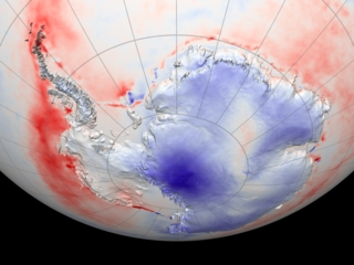
This peculiar figure is still up at a NASA site. The cooling rates are monstrously high (per annum!) and the boundary between land and sea is too sharp and there is altogether a misleading amount of detail. I seem to recall William Connolley warning me that this map was broken. But there it sits.
Meanwhile Robert Rohde's wonderful GlobalWarmingArt site finds the evidence equivocal:

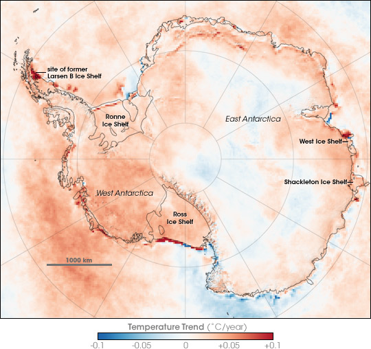
Here the rates are per decade, and while still large, are not stunningly large. The time series are longer and hence perhaps less noisy, and the trends are far less uniform. (And as usual, Robert has made a visually beautiful image. Quite a few of those many hits to this site have been people coming by to admire my closeup of one of his sea level rise maps.)
Anyway, the NASA site with the peculiarly shaded map has a link to:
Comiso, J. C., Variability and trends in the Antarctic surface temperatures from in situ and satellite infrared measurements, J. Climate, 13(10), 1674-1696, 2000; Kwok, R, and J.C. Comiso, Spatial patterns of variability in Antarctic surface temperature: Connections to the Southern Hemisphere Annular Mode and the Southern Oscillation, Geophys. Res. Lett., 29(14), 10.1029/2002GL015415, 2002;And therein we find this:

Although the NASA web page references the article, and while it has some obvious features in common, this figure doesn't perfectly match their fancy shaded map (check the area by the Ross Sea). That said it does show relatively steep gradients at the shore, and very high rates of change. Notice that the warming signal in the surrounding seas is far more pronounced than the cooling in the interior. Notice especially the intense warming near the Amundsen embayment, (a bit west of South America) which is spectacularly not where you want it.
So what's going on?
Wikipedia (and thereby, William, no doubt) refers us to
Thompson and Solomon 2002, Interpretation of Recent Southern Hemisphere Climate Change, Science, v 296 pp 895 ff.They in turn make a strong case for a correlation of cold Antarctic interiors and a tightening of the "SAM", which is the anomalously strong phase of the Antarctic polar vortex, a mode which appears to be increasing, and which can be dynamically attributed to a sharp decline in ozone over the period record. Ozone, of course, heats the stratosphere, so its decline will lead to anomalously cold temperatures. Then you need to invoke the thermal wind law and (hmm skipping a few steps) voila! a tightened Antarctic vortex, and tightened temperature gradients around the Antarctic rim.
Of course for every person worried about the retreat of Arctic sea ice there is somebody willing to celebrate the advance of Antarctic ice. The map shows that ice is advancing through the relatively limited areas of cooler water, but that doesn't do much to separate cause and effect. Any ideas out there?
Anyway the short version of the story is at least plausibly argued to be like this. Antarctica seems to be special because of ANOTHER human impact on the global environment. As the ozone depletion subsides, this will be tested, as the anticipated forcings will both be towards warming in the Antarctic interior.
Update: I see Atmoz has taken this on in plenty of detail. The info I wanted from William is there too, along with many comments. And he says the shiny map is "probably the work of a PR droid" and points to this, via NASA, from Wikipedia:
Go figure.
I think there is actually something to complain about here in a McIntyrean way: how are these drastically different results from a single agency supposed to be reconciled? I note that the web publication of the later image refers to the earlier one without explaining the dramatic differences.
And while I haven;t heard a cogent explanation for the advancing Antarctic sea ice, I have heard a cogent explanation for interior cooling, along with, now, data that shows it isn't happening...
None of which changes the fact that so far all evidence seems to agree that warm water is being delivered to the structural weak point of the West Antarctic Ice Sheet.


15 comments:
Thanks Mike for starting this off, and starting it so well. You got me hooked... now how am I going to do the other work I gotta do?
I've taken out the old NASA image and put in this current one on my page, with URL; I'm glad I could remove all the rude words around that issue.
As to quality of data. Well, it is AVHRR - satellite - of similar quality to other satellite data, IMHO. What interests me is the sharp edges between land and ocean. To me, this fits the Svensmark hypothesis (increased albedo over ice sheets, decreased albedo over sea, over the last 20 years) a lot better than the ozone depletion one, at this stage. However, I'm open to possibilities. And it would be interesting to compare this picture with one done for the last ten years - if Svensmark is right I would expect to see a trend reversal, with mainland temp rising and peninsula/SST temp falling.
Thanks.
"Michael", not "Mike". Or "mt". Or "Dr. Tobis". No "Mike" please.
Of course, RealClimate has the scoop on Svensmark.
Here's an earlier article by Gavin Schmidt that refrains from blaming Svensmark for his press releases, while not leaving those press releases themselves blameless. It acknowledges the possibility that the cosmic ray mechanism exists while questioning its correlation with the actual global temperature trend.
Here's a later article that has less doubt about what game he is playing.
Unfortunately, this is not really a game in the sense of recreation. Petty little academic positioning squabbles really ought to take a back seat to the viability of the planet.
The short version is this summary by Rasmus Benestad:
"I have the impression that the A&G article comes from the same school as "The Skeptical Environmentalist", which also has been criticised for cherry picking references to make mere speculation appear as more solidly founded. To ignore aspects that don't fit the hypothesis is definitely not science. Neither is adjusting data so to provide a good fit without a solid and convincing justification. Science, however, means objectivity, transparency, repeatability, and in principle the possibility of falsification. Furthermore, it is only a lack of respect for the readers to publish an article that doesn't provide all relevant sides to the story. I hope that Svensmark reads my comments and responds to them here at RealClimate. I also hope that this is read by scholars and journalists who start asking the critical questions. I do not know the answer to the questions that I pose here, so I'd be interested to hear your view."
Specifically, any alternative theory to be even remotely plausible must also account for 1) the failure of the greenhouse perturbation to apply and 2) the zonal and vertical signatures of the temperature signal, neither of which seem to be even remotely addresses by the cosmic ray folks.
As far as I know the alternative hypotheses seem to think that the global mean temperature (insofar as the acknowledge it exists!) is the only observation worth explaining.
Finally, Lucy/Anne, I "gotta" say I continue to doubt you are who you say you are. For instance I am currently of the opinion that you are American, based on the vernacular in the first paragraph above. I am sure you will claim you were being jocular, but it just seems a perfectly natural way for someone from the east coast of the US to express him, er, or herself, and very peculiar for an English woman. Readers in the UK, please correct me if this is wrong.
In any case I don't think you do anybody any favors by your choice of which evidence to feature. Rasmus' comment applies to anyone in search of reason.
MIchael:
1 step forward and 2 steps back! As a Brit I see nothing un-British in Anne's comments to date. "Rude" for example is very English. I don't see hooked or gottas as being particular "Americanisms" at this point. Of course you may have access to additional data and then I will have the proverbial egg on my face. For now, I suggest you ask Anne a question rather than make a rather insulting attribution. That's typically how we Brits do it, don't you know.
The string, however, will be useful.
Since this is the extension of the "science, impartial honesty, advocacy, stridency, idiocy, dissembling..." thread, and the phenomenon of investigation of AGW science from outside the profession...
I think there is a "must-see" discussion going on over here. Remarkably, the whole AGW theory is wrong because the concept of conservation of energy turns out to have been all wrong. Who knew?
It's an odd feeling reading that. On the one hand, it is burst-out-loud-laughing funny, but it is also very, very sad.
Yeah, one hardly knows where to begin...
Wow!
"since the radiative effect we are arguing over includes greenhouse gases, why do you use 6.36*10e6 as the radius to compute the radiative area instead of, say, the top of the stratosphere?"
and
Chris:... This is where we get the figure of 0.30"
That's the incoming albedo. The outgoing albedo cannot be measured in this fashion, and can only be estimated.
and
Many of us are capable of understanding 'vastly more complicated calculations'. Why not share them with us?
This is great stuff!
"one hardly knows where to begin"
Yes, absolutely, I think that people on all sides of the AGW debate would agree with that one. Certainly for a long time I felt myself flying back and forth between lots of conflicting statements. I now realize that the "original" thread to this one was about non-professionals (like myself?) getting into AGW science. Sure, and this was with three crucial factors: (1) serious evidence of corruption at the heart of the AGW science (2) very serious consequences affecting me personally IF the AGW science was correct, therefore I needed to grasp the science adequately, and (3) my concern for evidence that was not ad hom, at every step. Otherwise I would have been happy to continue to leave it to the professionals.
Therefore I had to go right back to basics. Not to throw out of the window things like the law of conservation of energy, that would be silly. But to ask very, very basic questions. And I discovered very, very basic flaws. Like corruption in the IPCC science, as Monckton showed, both directly and in refuting Schmidt's "Cuckoo Science" to which Schmidt never did a response that I could find (I looked). Like corruption in the IPCC process, as Bishop Hill has just told the story about, concerning Mann, Ammann and Wahl. Like evidence that temperature drives CO2 rather than vice versa - whatever the greenhouse theories say and models predict - which isn't to rubbish the latter either, just to put them in the right order of importance. Evidence comes first. Like evidence that bears out Svensmark et al (eg Svensmark's answers to Damon & Laut, which RC neglects to mention as he should since he refers to D&L - and this is about evidence of the primary role of solar power both TSI and magnetic flux).
Gradually, and with seesaws, my first preferences on who to start off by trusting, changed. Of course, trust must still be open to inspecting evidence. I've noted the new Antarctica picture at the top, which certainly plays down the first pic. I hope to include this pic as well on my site now. I checked the dates which both pics span, and although the new pic IS a later date span, I would not regard this as being a big enough difference to explain the difference in the two pics according to my thesis (see above). Or it might be. I've just about reached the limits of my savvy with this. I shall probably wait for other more expert skeptics to put up threads on this, and then jump in with this evidence, or google to see if there are already thoughts about this.
I had already read the RC article and checked all the checkable links - some crucial ones are unavailable. Ear-to-the-ground time. Thanks for the info, meanwhile.
Yes, again, I am a Brit. Takes one to know one perhaps?
Test your science savvy!
Michael:
I went to Deltoid. After a pretty good start it is now more heat than light.
"I think there is actually something to complain about here in a McIntyrean way: how are these drastically different results from a single agency supposed to be reconciled?"
Easy. The more recent image--Two Decades of Temperature Change in Antarctica is based on data that uses a different algorithm with better cloud screening. The data underlying both images are from the same instrument and the same research group. At the time of publication the original was state of the art, but is now superseded.
The extreme change along the "boundary between land and sea" is a reflection of change in the location of the ice margin, with obvious effects on temperature.
Yes, the very tight maxima at the ice margin are easy enough to understand. Somewhat harder to understand is the weak penetration of ocean temperature anomalies into the interior and vice versa.
But the first picture simply looks wrong. What's more, William has said it is wrong, reinforcing that. And the differences between the first and last map are so vast that you'd think the latter would not just refer to the former in passing as a "previous version".
I don't have to doubt the whole of climate science to find this particular situation unsatisfactory. If the older map is in error it should be itself marked as such and the error explained in detail, even if only "the map was drafted by a nonspecialist who was unable to spot the glaring inconsistencies and was inadequately vetted by science staff. We apologize for the inconvenience." If indeed there is more to it than that, the later map and the wikipedia article shoulod explain what it is all about.
These are services that we are paying for and they ought to be done right. Failing that, they ought to be corrected, not just left hanging out there. I don't see a justifiable way to explain the current configuration.
Tidal, It is telling that if you get all right or just one wrong in that science quiz, it says "You are a geek!".
Better not be a geek and rather stay ignorant of science.
All the time you see it in the American news media, reporters disrespecting science and engineering.
Excellent point, GL. I am so used to this sort of thing that I didn't even notice the insult.
Or perhaps I was just so put off by the literally elementary level of the questions that I was distractde. I believe most eighth graders should know these things.
But it is indeed very telling that "winning" this contest earns you the title "geek". Gee thanks. I'll be sure to get a couple wrong next time. I get it now.
Michael: your pix, which was on wiki till I threw it out, gets discussed extensively at http://en.wikipedia.org/wiki/Talk:Antarctica_cooling_controversy. Sadly there is a huge pile of septic POV pushing there, so most of the discussion is dull. Probably the comment you want is 'Update from NASA I drew the discussion above to NASA's attention and they have been reviewing and refining their presentation. Their response concludes, "As a result, we have decided to publish an updated image on the Earth Observatory with Dr. Comiso's assistance. The image should be available in the next week or two. Once again, thanks for bringing this issue to our attention."', which is the point at which the septics gave up.
Post a Comment